File:ACA Panel Chart v1.png
本预览的尺寸:800 × 448像素。 其他分辨率:320 × 179像素 | 640 × 358像素 | 1,305 × 731像素。
原始文件 (1,305 × 731像素,文件大小:186 KB,MIME类型:image/png)
Understanding the chart
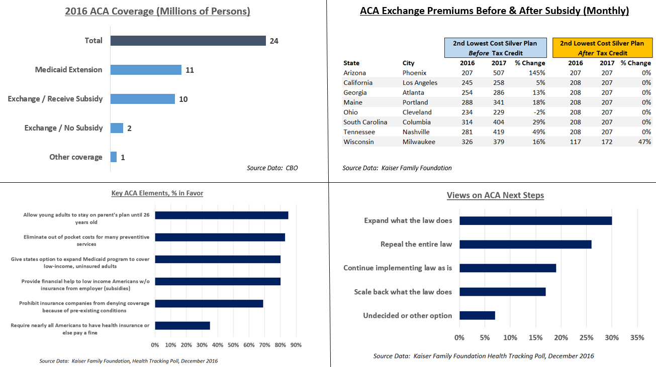
This panel chart illustrates several aspects of the Affordable Care Act (ACA). It includes coverage data from the CBO,[1] cost data from Kaiser,[2] and public opinion polls from Kaiser.[3]
Key points:
- There were 24 million covered by Obamacare exchanges and the Medicare extension. Of the 12 million on the exchanges, 10 million received subsidies.
- Key parts of the ACA are very popular, although the mandate is unpopular.
- The electorate narrowly prefers retaining or expanding the ACA, over repealing or scaling it back.
- Costs have gone up pre-subsidy on the exchanges, but subsidies (tax credits) rose as well, offsetting these increases. After subsidy, health insurance costs changed little from 2016 to 2017. The second lowest cost silver plan is a popular plan also used for calculations of subsidies. Prices shown are for 40-year old non-smoker earning $30,000 / year.
References
- ↑ Federal Subsidies for Health Insurance Coverage for People Under Age 65:2016 to 2026. CBO. Retrieved on November 23, 2016.
- ↑ 2017 Premium Changes and Insurer Participation in the Affordable Care Act’s Health Insurance Marketplaces. Retrieved on December 3, 2016.
- ↑ After the Election, the Public Remains Sharply Divided on Future of the Affordable Care Act. Kaiser Family Foundation (December 3, 2016).
摘要
| 描述 |
English: This panel chart illustrates several aspects of the Affordable Care Act, including coverage, cost, and public opinion. |
| 日期 | |
| 来源 | 自己的作品, using source data from CBO and Kaiser Family Foundation |
| 作者 | Farcaster |
许可协议
我,本作品著作权人,特此采用以下许可协议发表本作品:
本文件采用知识共享署名-相同方式共享 4.0 国际许可协议授权。
- 您可以自由地:
- 共享 – 复制、发行并传播本作品
- 修改 – 改编作品
- 惟须遵守下列条件:
- 署名 – 您必须对作品进行署名,提供授权条款的链接,并说明是否对原始内容进行了更改。您可以用任何合理的方式来署名,但不得以任何方式表明许可人认可您或您的使用。
- 相同方式共享 – 如果您再混合、转换或者基于本作品进行创作,您必须以与原先许可协议相同或相兼容的许可协议分发您贡献的作品。
文件历史
点击某个日期/时间查看对应时刻的文件。
| 日期/时间 | 缩略图 | 大小 | 用户 | 备注 | |
|---|---|---|---|---|---|
| 当前 | 2016年12月11日 (日) 16:51 | | 1,305 × 731(186 KB) | Farcaster | Correction |
| 2016年12月4日 (日) 22:18 |  | 1,420 × 793(271 KB) | Farcaster | Clarify premiums are monthly | |
| 2016年12月4日 (日) 17:08 |  | 1,416 × 795(269 KB) | Farcaster | User created page with UploadWizard |
文件用途
以下页面使用本文件:
全域文件用途
以下其他wiki使用此文件:
- en.wikipedia.org上的用途