File:Piecharts.svg

此SVG文件的PNG预览的大小:689 × 494像素。 其他分辨率:320 × 229像素 | 640 × 459像素 | 1,024 × 734像素 | 1,280 × 918像素 | 2,560 × 1,835像素。
原始文件 (SVG文件,尺寸为689 × 494像素,文件大小:39 KB)
摘要
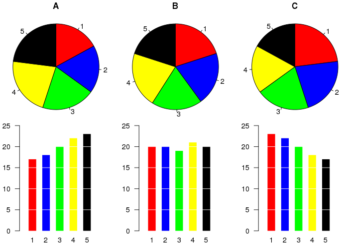
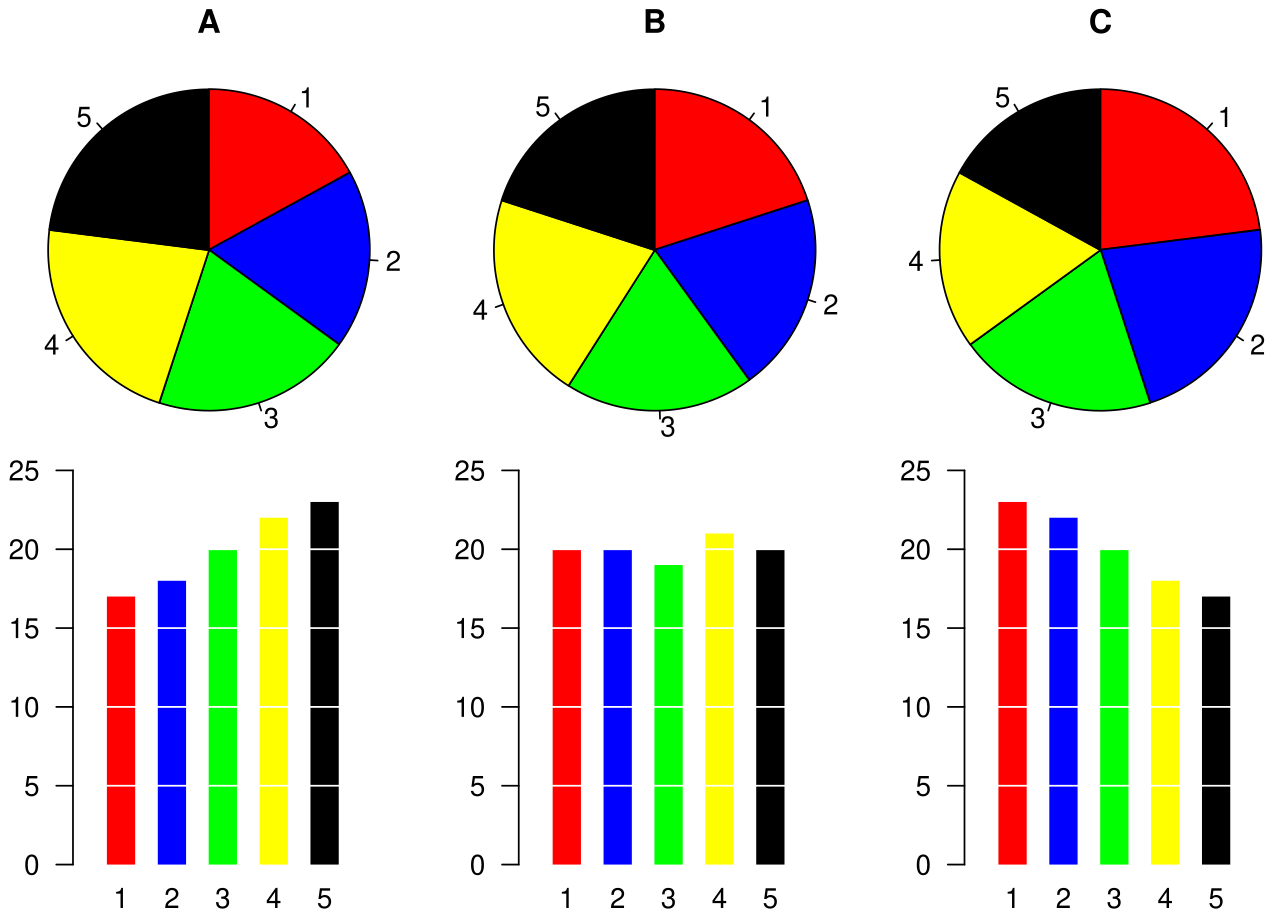
Example of a pie chart, along with a bar plot showing the same data and indicating that the pie chart is not the best possible chart for this particular dataset.
The graphic was created by User:Schutz for Wikipedia on 28 August 2007 using the R statistical project. The program that generated the graphic is given below. The graph was exported in postscript format, converted to SVG using the pstoedit command, and the layout was slightly modified using Inkscape before upload.
许可协议
文件历史
点击某个日期/时间查看对应时刻的文件。
| 日期/时间 | 缩略图 | 大小 | 用户 | 备注 | |
|---|---|---|---|---|---|
| 当前 | 2007年8月28日 (二) 08:33 | | 689 × 494(39 KB) | Schutz | == Summary == Example of a pie chart, along with a bar plot showing the same data and indicating that the pie chart is not the best possible chart for this particular dataset. The graphic was created by User:Schutz for Wikipedia on 28 August 2007 usi |
文件用途
以下页面使用本文件:
全域文件用途
以下其他wiki使用此文件:
- cy.wikipedia.org上的用途
- el.wikipedia.org上的用途
- en.wikipedia.org上的用途
- eu.wikipedia.org上的用途
- fi.wikipedia.org上的用途
- he.wikipedia.org上的用途
- he.wikibooks.org上的用途
- ja.wikipedia.org上的用途
- pl.wikipedia.org上的用途
- pt.wikipedia.org上的用途
- ta.wikipedia.org上的用途
- tr.wikipedia.org上的用途
- uk.wikipedia.org上的用途