User:Gary.sempai/沙盒/Transport
| 樣式 | 無襯線 |
|---|---|
| 分類 | Grotesque Mixed Signage |
| 設計師 | 祈年雅 賈慧慈 |
| 創造日期 | 1963 |
| 範例 | |

Transport是一套用於交通標誌的無襯線字體,由祈年雅及賈慧慈[1]設計。
联邦高速公路字体(英語:Highway Gothic),或称为高速公路标识标准字母(英語:Standard Alphabets for Highway Signs),是一套无衬线字体,由美国交通部下属的联邦高速公路管理局(FHWA)开发,并被用于美国以及加拿大、土耳其、墨西哥、澳大利亚、西班牙、委内瑞拉、荷兰、巴西、智利、中华人民共和国、中華民國、马来西亚、印度尼西亚、泰国、蒙古国、厄瓜多尔、新西兰等地的道路标志,在沙特阿拉伯也有部分使用。这款字设计初衷是能在一定距离和高速的条件下最大限度地保证易认性。其他版本,比如 Highway Gothic 以及面对公众出售的 Interstate 带有设计成方形的句号;官方标识上的标点是圆形。
is a sans serif typeface first designed for road signs in the United Kingdom. It was created between 1957 and 1963 by Jock Kinneir and Margaret Calvert as part of their work as designers for the Department of Transport's Anderson and Worboys committees.[2][3]
History 编辑
Before its introduction, British road signs used the capitals-only Llewellyn-Smith alphabet that was introduced following the Maybury Report of 1933 and revised in 1955–57. Older signs, known as fingerposts, tended to use a variety of sans serif alphabets as supplied by their manufacturers. For the kinds of roads on which either of these alphabets was likely to be seen, legibility was not a pressing issue, but the planning and building of Britain's first motorway in the 1950s was a catalyst for change.
The Ministry of Transport appointed an Advisory Committee on Traffic Signs for Motorways under the chairmanship of Sir Colin Anderson in 1957 and Jock Kinneir and his assistant Margaret Calvert were appointed as graphic designers to it. All aspects of signing were investigated and tested, initially on the Preston bypass (1958, now part of the M6 motorway), before their introduction on the (London–Yorkshire) M1 motorway a year later. The committee looked at examples from other European countries as well as the USA but Kinneir and Calvert found them somewhat harsh and unsatisfactory. Instead, they developed a more rounded typeface with distinctive tails to 'a', 't', and 'l', and bar-less fractions, all of which helped legibility.
The department, seeing the successful early results of this work then appointed another committee, under the chairmanship of Sir Walter Worboys and again using Kinneir and Calvert as designers, to look at Traffic Signs for All-Purpose Roads. Work for this also resulted in the introduction of the pictogram signs based on those recommended by the 1949 United Nations World Conference on Road and Motor Transport.
Characteristics 编辑
Two forms of the typeface exist; Transport Medium and Transport Heavy.[4] Both have the same basic form, but Transport Heavy is boldface, to allow easier readability of black letters on white backgrounds, such as those used on non-primary roads, while Transport Medium is lighter, and is used for white letters on dark backgrounds, such as the green primary route signs.
The Transport typefaces are the only ones allowed on UK road signs (except for motorway signs, where route numbers appear in their own separate typeface known as Motorway).[5]
Only a limited number of symbols are available in Transport, mainly those commonly used in road signs, such as apostrophes, the pound sign and certain vulgar fractions such as ½ and ⅓.[6] Various diacritics are also available, for use in languages other than English, such as Welsh and Irish.
Other uses around the world 编辑
Although developed in the United Kingdom, the typeface has been used in many other countries around the world. In addition to the Crown dependencies, British overseas territories and some limited residual usage in Commonwealth states, the typeface is also used in Hong Kong, Iceland, Ireland, Greece, and Portugal, and in much of the Middle East. Denmark uses a variation with added spacing and modified figures. Italy and Spain use bolder variants, called Alfabeto Normale in Italy and Carretera Convencional in Spain (the latter originally only on non-motorway roads, but since 2014 it applies to any new sign both in motorway and non-motorway roads).
In countries where other scripts (such as the Arabic script) are used, Transport is often used for Latin transliterations.[2][7] Road signs in the Republic of Ireland use all-caps Transport Heavy for English names; for Irish names, mixed-case Transport Heavy oblique is used with variants for A, a, i, M and N: script a, dotless i, and tall versions of m and n.
In Indonesia, since April 2014, changeable message signs/electronic signs have used Transport.[8]
The Clearview font is a variant of Transport that is currently used mainly on North American highway signs.
Digitisations 编辑
The original Transport family, with its two weights, has been digitised by URW++.[4]
New Transport 编辑
An updated version of the typeface has been developed by Henrik Kubel of A2/SW/HK and Margaret Calvert during 2012, with the family expanded to include six different weights (Thin, Light, Regular, Medium, Bold, Black) with oblique stylings to complement them. It also has other features including text figures and small capitals.[9]
One of its first public uses has been on the UK's revamped central government website, 'GOV.UK', where it has been selected as the sole font for all text.[10]
Transport New 编辑
An updated though unofficial family based upon Transport was first released by independent foundry K-Type in 2008. The family includes Light, Medium and Heavy weights along with true italics which were added in 2015.[11]
Users 编辑
- Greece - Road signs (Greek letters added)
- Hong Kong - Road signs
- Ireland
- Italy - Road signs
- Indonesia - Variable message signs
- Malaysia - Road signs
- Portugal - Road signs
- Spain - Road signs
- United Kingdom - Road signs, government website and some government letters
Gallery 编辑
-
 A Scottish sign using the typeface on the Isle of Skye, with placenames given in both Scots Gaelic and English, and distances shown in miles.
 -
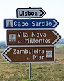 Example of the use of the typeface in road signs in Portugal
 -
 Irish road signs using dotless i and single-storey (script) a (upper and lower case)
 -
 Road signs in Italy use a variation of the typeface called Alfabeto normale, or the condensed form of it, called Alfabeto stretto (the latter is the one on the top and the bottom signs in the photo).
 -
 The typeface is in use on Icelandic road signs. This example shows the locations of villages and farms in a rural area of the country.
 -
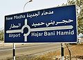 The typeface is in use in the Middle East, in this case within the Omani enclave of Madha, within the United Arab Emirates. The Latin alphabet text has been translated from the Arabic, which is also shown.
 -
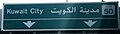 Another example of the typeface in use in the Middle East, this time in Kuwait.
 -
 Use of the Transport font in Kerala, India
 -
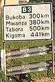 The Transport font is used in several ex-British colonies, such as this one in Kagera Region, Tanzania
 -
 Transport font road sign in poor state of repair, Kagera Region, Tanzania
 -

-
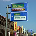 Gantry road sign with Transport typeface used in Malaysia


See also 编辑
- Motorway Typeface — Another font used for motorway route numbers on motorways, also designed by Kinneir & Calvert.
- Rail Alphabet — The equivalent font on Britain's railways, also designed by Kinneir & Calvert.
- Johnston Typeface — The London Underground font, designed by Edward Johnston.
- Public signage typefaces
- Highway Gothic — A font also used widely around the world for traffic signs.
References 编辑
- ^ 邱益彰@道路研究社. 《香港道路探索──路牌標誌x交通設計》 第二版. 非凡出版. 2019年7月: 頁12. ISBN 9789888573370.
- ^ 2.0 2.1 Design Museum — Jock Kinneir + Margaret Calvert, URL accessed 16 May 2006
- ^ Calvert, Margaret. New Transport. A2-Type. [1 March 2016].
- ^ 4.0 4.1 Transport. MyFonts. URW++. [1 March 2016].
- ^ See Regulation 13 and Schedule 13 of The Traffic Signs Regulations and General Directions 2002 (legislation.gov.uk)
- ^ Chris's British Road Directory, URL accessed 5 September 2017
- ^ FAQ §3.6 Fonts on signs from Chris's British Road Directory
- ^ Indonesia Transport Minister's Rule No. 13/2014 互联网档案馆的存檔,存档日期6 October 2014.
- ^ New Transport. New Transport. [19 June 2017].
- ^ A few notes on typography. GOV.UK. [19 June 2017].
- ^ Transport New. K-Type. [17 June 2017].
External links 编辑
- Department for Transport alphabet drawings
- New Transport - sale, history and .pdf specimen
- Traffic signs working drawings: TSRGD 2016 schedule 17
- World Transportation Organization The world transportation organization (The Non-Profit Advisory Organization)